customcursor
Mouse cursor and arrow beautification
 Flat icon design
Resources provided by a Japanese website, all icons are free for commercial use
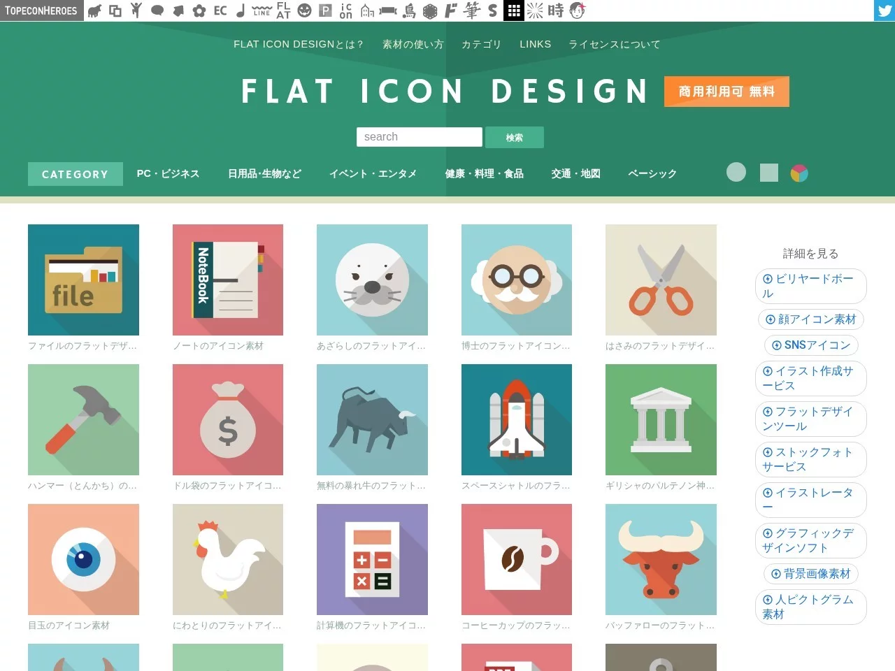
Many designers always fall into the same trap when looking for flat icons: either the styles of the materials are mismatched, or the commercial usage rights are ambiguous, making them uneasy to use. In fact, there is a Japanese professional site that can solve these problems — Flat icon design, which specializes in providing free-for-commercial-use flat icons, is a private material repository I have collected for more than half a year.
Official website: http://flat-icon-design.com/
Don’t start by searching for “flat icons”; first think about whether you want a small but high-quality set of materials, or a huge library of tens of thousands of icons. Flat icon design takes the small-but-high-quality approach. Currently, the entire site has only nearly 500 icons, all of which are custom-designed, not mass-produced generic ones.
This is actually quite important, because too many people spend half an hour flipping through search results when looking for icons, and finally pick out ones with inconsistent styles, which instead wastes time.
Opening the site doesn’t require much effort to find categories; the high-frequency types for daily use are visible at a glance. The most common ones are PC-related and business categories, with elements like devices, office supplies, and communications all included. From selection to download, it takes just two clicks, no need to wait for loading or fill in information.
I use their icons much more frequently than those from large libraries, mainly for these types of projects:
Using icons from this site throughout the same project won’t cause style conflicts, which is much more reliable than gathering icons from multiple sources and saves a lot of coordination effort.
Free for commercial use is its biggest advantage, but it’s not completely unrestricted. Before downloading, remember these rules to avoid crossing the line:
Do icons require payment? No, most icons are free for commercial use, you can download and use them directly without extra cost.
Can they be used for personal works and commercial projects? Yes, whether it’s a small personal creation or a company’s commercial project, it’s fine, as long as you abide by the three rules mentioned above.
What if there aren’t enough materials? You can use it as your main style library, and supplement with other flat material sources, just pay attention to maintaining visual consistency.
Compared with large libraries that have tens of thousands of materials, the value of Flat icon design lies not in quantity, but in quality, clear copyright, and being ready to use directly.
When I receive web, app or PPT projects, I will first pick a set of icons here, so I don’t have to spend time sifting through hundreds of images, which improves both efficiency and quality.