Font Transporter
Free Commercial Font Downloads
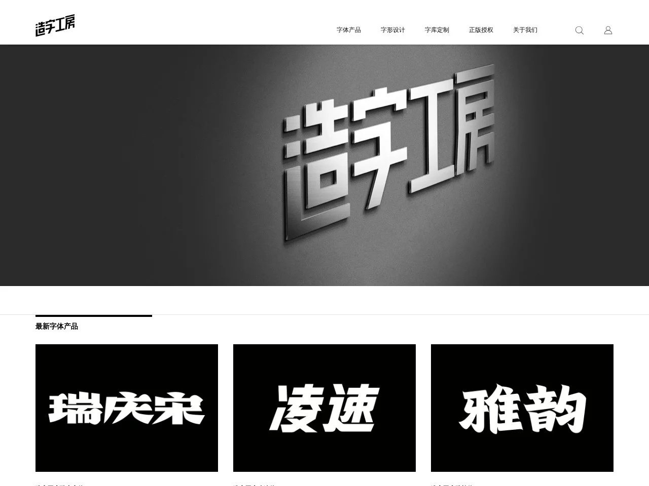
 造字工房
A team dedicated to the design and development of new Chinese character typefaces
Anyone who seriously works on brand visuals or content creation knows how important choosing the right font is — the wrong one can make the whole style fall apart, while the right one can build brand recognition straight away. I stumbled into quite a few font copyright traps before I finally got to know the ways of 造字工房, this professional team.
Official website: https://www.makefont.com/
I once helped a chain bookshop with a VI upgrade. At first I thought I could make do with free fonts, but either the style was off or they were so widely used that the bookshop’s Chinese aesthetic simply couldn’t stand out. Only later did I learn that 造字工房’s custom service can genuinely fit the needs of different scenarios.
It’s not that they only take on big-brand work — smaller brands can find a fitting solution too. You don’t have to spend a fortune on a full character library of over 6,000 glyphs; if you only need a few characters for a LOGO, they can precisely design the corresponding glyphs, cutting costs considerably while keeping everything consistent with your brand’s tone. For cultural tourism projects that call for glyphs in multiple styles, they also have a well-established collaborative workflow — they have even taken part in a Disneyland project before, and that experience is more than enough to support all kinds of large-scale needs.
When I later worked on copy layout for cultural and creative products, I tried their 问藏书房体 — that refined Chinese flair matched the texture of cultural products perfectly, far more pleasing to the eye than the free fonts I had used before. Their font matrix is quite comprehensive, covering styles from traditional to modern; designers find them easy to work with, and audiences find them comfortable to read.
静黑体 is my go-to for office materials: the strokes are clean and orderly, and whether it is company PPTs or staff handbooks, the typeface has a steady balance and is easy on the eyes, fully meeting the practical demands of office settings. For new media content of trendy brands, you would want something with a creative touch like 摩登体 — fashionable and energetic, perfectly in tune with young users’ aesthetics. But a word of warning here: most fonts require a paid licence for commercial use, and only a few, such as 问藏书房体, are free for commercial use. Always check the licence terms before use, or you might end up like me, nearly getting into copyright trouble for using an unlicensed font.
I once saw a peer contacted for compensation after using an unlicensed 造字工房 font. Only later did I learn that they handle dozens of copyright disputes every year — they are truly serious about infringement. This seriousness is not about making trouble; it is about setting rules for the whole industry. After all, fonts are original works that designers polish through sleepless nights. If anyone could use them for free, who would still bother to do professional design?
Now, whenever I pick a font, I first check the licence on 造字工房’s official website. Even if buying a licence costs a bit, it beats living in fear later on. After all, using properly licensed fonts not only lets you create with peace of mind, but also makes the original-creation atmosphere of the whole industry healthier — a long-term benefit for those of us in content and design.